

Candlesticks charts are an advanced tool for technical analysis: they summarize cryptocurrencies’ price movements over a time interval
Now that we are getting deeper and deeper into the maze of cryptocurrency markets, let’s try to go one step further and understand how real traders who take advantage of technical analysis read charts.
What are Japanese candlesticks?
You have surely seen on some trading platform these strange charts composed of red and green vertical bars. These bars are known by the poetic name of “Japanese Candlestick”. The history behind this type of chart is as exotic as its name. The invention of candlesticks dates back to the 17th century, with the aim of predicting the price of rice.
Yes, technical analysis is nothing new.
If this article will arouse your curiosity to go deeper into this story, you will discover incredible details and nomenclatures, which make the ancient technical analysis a real Japanese art of the market.
Now let’s see how to read these charts: in this way, we will understand why they are so useful.
How to read candlestick charts
Candlesticks summarize price movements over a time interval, any time interval, which is usually selectable from the interface you are using. This time span can be just one minute or an entire day. Let’s take as an example a candlestick that symbolizes the price movement of Bitcoin over a single day. The whole chart will then represent the trend over a number of days.
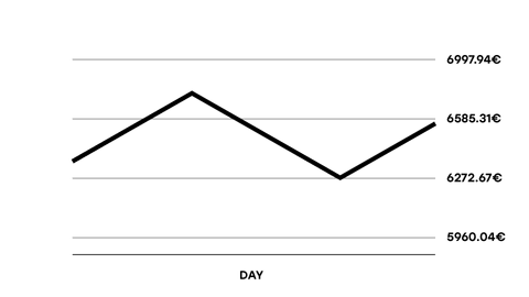
Let’s suppose that during day 1, represented by a single candle, these price changes occurred:
Day 1 for BTC
- Open: €6330
- Maximum: €6620
- Minimum: €6272
- Close: €6585
The corresponding line chart would look like this:
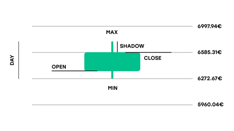
Let’s represent this day with a candlestick:
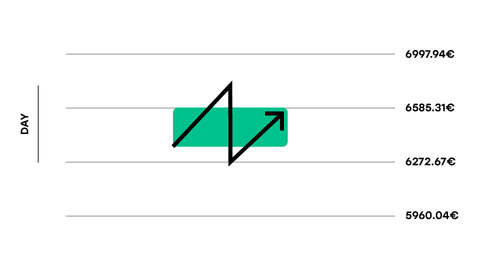
The body of the candle, the middle part in green, represents the difference in price between the beginning of the day and the end of the day.
The lower end, which marks the price at the beginning of the day, is called “open“, because it marks how the day opened.
The upper end, which marks the price at the close of the day, i.e. the last recorded, is called “close“.
The lines, similar to candle wicks, are called shadows. They represent the maximum and minimum price reached during the day. Shadows are essential for advanced technical analysis and should not be put aside.
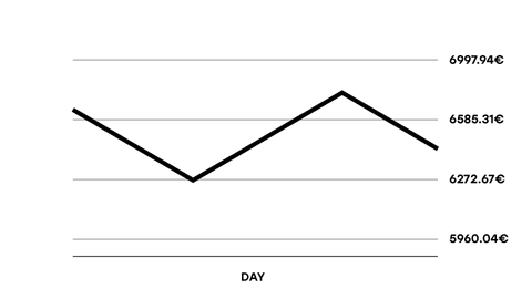
Let’s now see an example of a negative daily trend for Bitcoin, by looking at a red candle.
Day 2 for BTC
- Open = €6585
- Minimum= €6272
- Maximum = €6620
- Close = €6330
The corresponding line chart would look like this:
Now, let’s draw the candlestick:

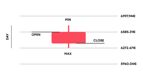
Being it a negative trend, the candle is red and the open will be higher than the close because the day will close in negative.
Why Japanese candlesticks are useful
Candlesticks are much more detailed representations of the price trend than a classic linear chart, so they are much more suitable for advanced technical analysis.
If we consider that the Japanese have been using them for 300 years, and have bothered to name every possible configuration of candles – as if they were tai chi positions – there must be a reason…
To get more and more familiar with technical analysis and chart reading, the best way is to start trying the new feature of Stepdrop: Up&Down.
Related Article


Download the Young Platform app


